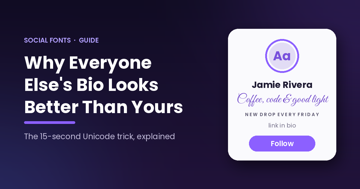
To put fancy fonts in a social media bio, use a free Unicode text generator like Social Fonts. Type your text once, pick a style such as bold, cursive, or small caps, tap Copy, and paste it into your Instagram, TikTok, X, or LinkedIn bio. The styling travels with the text, so it works even though no platform has a font menu.
That is the whole trick. The bios that stopped you mid-scroll, the ones with 𝗯𝗼𝗹𝗱 names and 𝒸𝓊𝓇𝓈𝒾𝓋𝑒 taglines, were not made by designers or by people with a special account type. They were made in about fifteen seconds by someone who knew where the tool was. The rest of this guide covers how it works, where each style holds up, and where to show restraint.
Why can’t you just change the font in your bio?
Because no major social platform gives you a formatting button. There is no bold, no italic, and no font picker anywhere in an Instagram bio, a TikTok caption, or an X post. The text field accepts plain text and nothing else.
Fancy fonts get around this by not being fonts at all. Tools like Social Fonts swap your letters for lookalike characters from Unicode, the universal character standard that includes thousands of symbols beyond the standard alphabet. A 𝗯𝗼𝗹𝗱 “b” is a different character than a regular “b”, the same way “b” and “β” are different characters.
That distinction matters for one practical reason: the styling is part of the text itself, not formatting applied on top of it. Copy it, paste it anywhere, and it survives. That is why this works in places that were never designed to allow it.
How do you add fancy fonts to any social media bio?
The process is the same on every platform, and it takes under a minute:
- Open Social Fonts in any browser. No app, no sign-up.
- Type or paste the text you want to style.
- Scroll the styles. There are 79 Unicode styles, from bold and cursive to gothic, outline, bubble text, and upside down.
- Tap Copy next to the one you want.
- Open the app you are updating, edit your profile, and paste into the bio field.
- Save, then view your profile as a visitor to check how it renders.
Step six is the one people skip. A style can look great in the generator and slightly off in a specific app, so a ten-second check saves you from walking around with a broken bio.
Which fancy font styles work where?
Almost all of them work almost everywhere, but support is not perfectly uniform. This table reflects how the common styles behave across the major platforms as of August 2026:
| Style | Instagram bio | TikTok bio | X bio and posts | Best used for | |
|---|---|---|---|---|---|
| 𝗕𝗼𝗹𝗱 | Yes | Yes | Yes | Yes | Names, one key phrase |
| 𝘐𝘵𝘢𝘭𝘪𝘤 | Yes | Yes | Yes | Yes | Taglines, emphasis |
| 𝒞𝓊𝓇𝓈𝒾𝓋𝑒 | Yes | Yes | Yes | Partial | Personal brands, creatives |
| ꜱᴍᴀʟʟ ᴄᴀᴘꜱ | Yes | Yes | Yes | Yes | Headers inside a bio |
| Ⓑⓤⓑⓑⓛⓔ | Yes | Yes | Yes | Rarely | Playful accounts only |
| 𝔊𝔬𝔱𝔥𝔦𝔠 | Yes | Yes | Yes | Rarely | Niche aesthetics |
| Upside down | Yes | Yes | Yes | No | Novelty, sparingly |
“Partial” and “Rarely” mean the characters will still paste and display, but they read as out of place for that platform’s audience. A cursive LinkedIn headline is technically possible and professionally questionable. Match the style to the room.
Do fancy fonts actually get noticed, or is this just decoration?
The bio is doing more commercial work than most people give it credit for, which is why standing out there is worth fifteen seconds of effort. According to GWI data published in DataReportal’s 2026 report, 62.8% of Instagram users use the platform to follow or research brands and products. The bio is the first thing those researchers read.
They are reading it constantly, too. Similarweb figures in the same DataReportal 2026 report show 65.4% of Instagram’s Android users open the app every single day. Every one of those sessions is a chance for someone to land on your profile, and the bio decides whether they stay.
Meanwhile the feed itself is getting less generous. Socialinsider’s Q1 2026 benchmark data puts the average Instagram engagement rate at 0.48% across all account sizes, down roughly 24% year over year. When your posts reach fewer people organically, the ones who do click through to your profile matter more, and a bio that reads like everyone else’s wastes that click.
Where should you use fancy fonts, and where should you hold back?
Use them where they create hierarchy: your name field, one line you want scanned first, or dividers between sections of a bio. A single 𝗯𝗼𝗹𝗱 line in an otherwise plain bio draws the eye exactly where you want it.
Do not style the entire bio. A wall of decorated text is harder to read than plain text, and it buries the one thing you wanted to stand out. The accounts that look effortless are usually using one style, once.
Two honest caveats. First, keep your Instagram name field mostly in plain text, because that field is searchable and Unicode lookalikes do not match what people type into search. Second, screen readers announce many Unicode characters one at a time or skip them, so anything essential, like what you do and how to contact you, belongs in standard characters. We cover this fully in our upcoming guide to fancy fonts and accessibility.
Why did we build a free one?
Because using the existing tools was miserable, and I say that as someone who sends clients to tools for a living. Every fancy text generator we tried was wrapped in pop-ups, interstitials, and ad units stacked between the input box and the copy button. The task takes fifteen seconds and the ads turned it into a minute of dodging.
So the team at Inertia Digital Marketing, the agency behind Social Fonts, built the version we wanted to use. No ads, no sign-up, no watermark, nothing to unlock. Type once, copy from any of 79 Unicode styles or 40 ASCII banner fonts, done.
“A bio is the cheapest real estate in marketing. It costs nothing to fix, everyone who checks you out reads it, and most businesses have never touched theirs. That gap is the opportunity,” says Adam Palmer, President of Inertia Digital Marketing.
What should you do Monday morning?
Open your own profile in an incognito window and read your bio as a stranger would. Most people have not looked at theirs in a year.
Then rebuild it in three moves. Put your name field in plain, searchable text. Write one line that says who you help and how, and set it in 𝗯𝗼𝗹𝗱 using the generator. Finish with a plain-text call to action pointing at your link.
Fifteen seconds of styling, one clear line, and you are ahead of most of the profiles in your niche. Not because fancy fonts are magic, but because almost nobody puts any thought into the field every visitor reads first.
Frequently asked questions
Are fancy fonts free to use?
Yes. Unicode characters are part of the same open standard as regular letters, and Social Fonts is free with no sign-up, ads, or watermarks. If a tool asks you to pay or register to copy text, use a different tool.
Will fancy fonts get my account banned or hurt my reach?
No platform prohibits Unicode characters in bios, and using them in a bio will not get you banned. Whether heavy use in captions affects reach is a separate question we examine in a dedicated post, but bio use is safe.
Why do my fancy fonts show as boxes or question marks for some people?
A small number of very old devices and apps lack the fonts needed to display certain Unicode ranges, so they show a fallback symbol instead. Bold, italic, and small caps have the widest support. The more decorative styles fail slightly more often.
Can I use fancy fonts in usernames and handles?
Usually not. Handles on Instagram, TikTok, and X only accept letters, numbers, periods, and underscores. Fancy fonts work in the display name and bio fields instead.
Do fancy fonts work in Instagram captions and comments, or just bios?
They work anywhere you can type text: bios, captions, comments, Stories text, and DMs. The characters are ordinary text as far as the platform is concerned.
Adam Palmer is President of Inertia Digital Marketing, a digital marketing agency working with clients from small business to multi-location enterprise and franchise operations. Across 15 years he has managed more than $50 million in paid digital campaigns, and he writes here about what actually moves numbers rather than what sounds good in a strategy deck. Inertia built and maintains Social Fonts, which is free and always will be. Find him on LinkedIn.